JJ du Plessis

About:

I’m a visual communication designer based in Naarm/Melbourne, focused on building thoughtful, cohesive brands. My work spans strategy, identity, editorial and digital design, always led by process, clarity and strong visual craft.

I create brand systems, publications and digital experiences for clients across education, arts, food and culture. My approach is grounded in research and collaboration, shaping design that’s both intelligent and practical.


Awards & Recognitions:

International Society of Typographic Design Membership

DINZ Best Awards Finalist 2024

DINZ Best Awards Bronze 2023

DINZ Best Awards Finalist 2022


Contact:

jjdp123@gmail.com

Selected Works

Updated: 21.11.2025

< click to scroll >

Selected Works

Updated: 21.11.2025

< click to scroll >

Selected Works

Updated: 21.11.2025

< click to scroll >

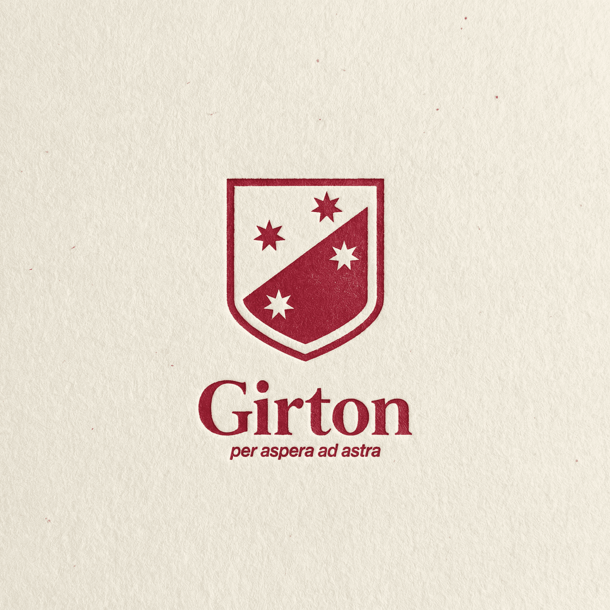
Girton Grammar

Girton Grammar is a leading independent school in Bendigo with a long-standing reputation for academic excellence and strong community values. The project is a comprehensive brand refresh designed to evolve the school’s image from traditional and formal to confident, contemporary and connected.

I led the identity development from strategy through to execution, overseeing the design of the new crest and logotype, establishing a refined typographic system, updating brand language, and directing photography and campaign art direction.

The refreshed identity will roll out across every facet of the school, from advertising and communications to signage, uniforms and digital platforms, creating a unified and enduring brand that honours Girton’s heritage while expressing its progressive vision for the future.

Client

:

Girton Grammar

Studio

:

Role

:

Brand Identity, Design Development

Year

:

On going

Click or Drag

Click or Drag

Click or Drag

Girton Grammar

Girton Grammar is a leading independent school in Bendigo with a long-standing reputation for academic excellence and strong community values. The project is a comprehensive brand refresh designed to evolve the school’s image from traditional and formal to confident, contemporary and connected.

I led the identity development from strategy through to execution, overseeing the design of the new crest and logotype, establishing a refined typographic system, updating brand language, and directing photography and campaign art direction.

The refreshed identity will roll out across every facet of the school, from advertising and communications to signage, uniforms and digital platforms, creating a unified and enduring brand that honours Girton’s heritage while expressing its progressive vision for the future.

Client

:

Girton Grammar

Studio

:

Role

:

Brand Identity, Design Development

Year

:

On going

Tap or Drag

Tap or Drag

Tap or Drag

Girton Grammar

Girton Grammar is a leading independent school in Bendigo with a long-standing reputation for academic excellence and strong community values. The project is a comprehensive brand refresh designed to evolve the school’s image from traditional and formal to confident, contemporary and connected.

I led the identity development from strategy through to execution, overseeing the design of the new crest and logotype, establishing a refined typographic system, updating brand language, and directing photography and campaign art direction.

The refreshed identity will roll out across every facet of the school, from advertising and communications to signage, uniforms and digital platforms, creating a unified and enduring brand that honours Girton’s heritage while expressing its progressive vision for the future.

Client

:

Girton Grammar

Studio

:

Role

:

Brand Identity, Design Development

Year

:

On going

Tap or Drag

Tap or Drag

Tap or Drag

Loam Journal

Loam Journal is an independent print publication and emerging brand platform exploring the intersection of land, culture and craft through a modern, grounded lens. As the foundational designer and strategist, I’ve worked closely with its founder from the very beginning to shape not only its visual identity, but also its strategic direction, values and long-term brand architecture.

My role extends beyond design execution, encompassing brand strategy, audience definition, tone of voice and core principles. By separating the strategy phase from the visual and publication work, we’ve ensured the brand grows with clarity and consistency as Loam expands into new realms beyond print.

From refining the brand’s essence and narrative to developing a tactile, contemporary visual language, I’ve approached the project holistically. I’m also leading the design and art direction for the first print edition, launching early 2026, including publication layout, typographic systems and a scalable design framework to carry through future issues.

Loam Journal is an ongoing collaboration with high creative ambition; a project I continue to shape through thoughtful design, strategy and storytelling.

Client

:

Loam Journal

Role

:

Creative Direction, Strategy, Development, Publication

Year

:

On going

Click or Drag

Click or Drag

Click or Drag

Loam Journal

Loam Journal is an independent print publication and emerging brand platform exploring the intersection of land, culture and craft through a modern, grounded lens. As the foundational designer and strategist, I’ve worked closely with its founder from the very beginning to shape not only its visual identity, but also its strategic direction, values and long-term brand architecture.

My role extends beyond design execution, encompassing brand strategy, audience definition, tone of voice and core principles. By separating the strategy phase from the visual and publication work, we’ve ensured the brand grows with clarity and consistency as Loam expands into new realms beyond print.

From refining the brand’s essence and narrative to developing a tactile, contemporary visual language, I’ve approached the project holistically. I’m also leading the design and art direction for the first print edition, launching early 2026, including publication layout, typographic systems and a scalable design framework to carry through future issues.

Loam Journal is an ongoing collaboration with high creative ambition; a project I continue to shape through thoughtful design, strategy and storytelling.

Client

:

Loam Journal

Role

:

Creative Direction, Strategy, Development, Publication

Year

:

On going

Tap or Drag

Tap or Drag

Tap or Drag

Loam Journal

Loam Journal is an independent print publication and emerging brand platform exploring the intersection of land, culture and craft through a modern, grounded lens. As the foundational designer and strategist, I’ve worked closely with its founder from the very beginning to shape not only its visual identity, but also its strategic direction, values and long-term brand architecture.

My role extends beyond design execution, encompassing brand strategy, audience definition, tone of voice and core principles. By separating the strategy phase from the visual and publication work, we’ve ensured the brand grows with clarity and consistency as Loam expands into new realms beyond print.

From refining the brand’s essence and narrative to developing a tactile, contemporary visual language, I’ve approached the project holistically. I’m also leading the design and art direction for the first print edition, launching early 2026, including publication layout, typographic systems and a scalable design framework to carry through future issues.

Loam Journal is an ongoing collaboration with high creative ambition; a project I continue to shape through thoughtful design, strategy and storytelling.

Client

:

Loam Journal

Role

:

Creative Direction, Strategy, Development, Publication

Year

:

On going

Tap or Drag

Tap or Drag

Tap or Drag

Set in Stone

Set in Stone documents the evolution of Wellington’s Cuba Street through the heritage lettering found on its buildings — using architectural typography as a way to connect the street’s past with its present. The project highlights the often-overlooked cultural significance of Cuba Street amid rapid urban development.

Thirteen buildings were selected for their distinctive lettering, each marking a different moment in the street’s social and architectural history. Archival research, including photographs, articles and historical records underpinned the narrative, grounding the project in a clear historical context.

The final outcome is a 220-page publication created in collaboration with an architectural photographer. Detailed documentation of each building is paired with archival material and typographic studies, creating an immersive visual record of Cuba Street’s shifting identity.

Set in Stone serves as both preservation and storytelling, celebrating the resilience of an iconic urban space and demonstrating how design can make local history visible, accessible and valued.

DINZ Best Awards

:

Collaborators

:

Andy Spain

Year

:

2024

Click or Drag

Click or Drag

Click or Drag

Set in Stone

Set in Stone documents the evolution of Wellington’s Cuba Street through the heritage lettering found on its buildings — using architectural typography as a way to connect the street’s past with its present. The project highlights the often-overlooked cultural significance of Cuba Street amid rapid urban development.

Thirteen buildings were selected for their distinctive lettering, each marking a different moment in the street’s social and architectural history. Archival research, including photographs, articles and historical records underpinned the narrative, grounding the project in a clear historical context.

The final outcome is a 220-page publication created in collaboration with an architectural photographer. Detailed documentation of each building is paired with archival material and typographic studies, creating an immersive visual record of Cuba Street’s shifting identity.

Set in Stone serves as both preservation and storytelling, celebrating the resilience of an iconic urban space and demonstrating how design can make local history visible, accessible and valued.

DINZ Best Awards

:

Collaborators

:

Andy Spain

Year

:

2024

Tap or Drag

Tap or Drag

Tap or Drag

Fickle Pickle

Fickle Pickle is a jalapeño relish brand that plays on contrast; fiery yet playful, homemade yet bold. The strategy centred on capturing that tension through tone and personality: a brand with bite, but one that doesn’t take itself too seriously.

The concept development explored how heat and humour could coexist visually, through expressive typography, punchy colour and a confident, slightly offbeat attitude. The art direction for photography builds on that spirit, favouring lived-in, real moments over polish. It’s about capturing spontaneous, everyday scenes that feel effortless and authentic. the strategy was to create a brand that speaks to people who value character, not perfection.

Client

:

Fickle Pickle

Studio

:

Role

:

Strategy, Design Development

Year

:

2025

Click or Drag

Click or Drag

Click or Drag

Fickle Pickle

Fickle Pickle is a jalapeño relish brand that plays on contrast; fiery yet playful, homemade yet bold. The strategy centred on capturing that tension through tone and personality: a brand with bite, but one that doesn’t take itself too seriously.

The concept development explored how heat and humour could coexist visually, through expressive typography, punchy colour and a confident, slightly offbeat attitude. The art direction for photography builds on that spirit, favouring lived-in, real moments over polish. It’s about capturing spontaneous, everyday scenes that feel effortless and authentic. the strategy was to create a brand that speaks to people who value character, not perfection.

Client

:

Fickle Pickle

Studio

:

Role

:

Strategy, Design Development

Year

:

2025

Tap or Drag

Tap or Drag

Tap or Drag

Fickle Pickle

Fickle Pickle is a jalapeño relish brand that plays on contrast; fiery yet playful, homemade yet bold. The strategy centred on capturing that tension through tone and personality: a brand with bite, but one that doesn’t take itself too seriously.

The concept development explored how heat and humour could coexist visually, through expressive typography, punchy colour and a confident, slightly offbeat attitude. The art direction for photography builds on that spirit, favouring lived-in, real moments over polish. It’s about capturing spontaneous, everyday scenes that feel effortless and authentic. the strategy was to create a brand that speaks to people who value character, not perfection.

Client

:

Fickle Pickle

Studio

:

Role

:

Strategy, Design Development

Year

:

2025

Tap or Drag

Tap or Drag

Tap or Drag

Johnny Ripe (Concept)

Johnny Ripe is a bakery brand built around handcrafted pies. The challenge with this project was to reimagine it for a market crowded with near-identical competitors. The goal was to create something bold and unmistakable, a brand that would stand out on the supermarket shelf.

The identity leans on distinctive typography with character, paired with bold, bright colour and simple graphic forms. Together, they create a visual language that feels confident, playful and instantly recognisable.

My design development focused on creating strong shelf presence and clear differentiation, building a system that cuts through the noise and feels genuinely fresh in its category.

Client

:

Johnny Ripe

Studio

:

Role

:

Design Development

Year

:

2025

Click or Drag

Click or Drag

Click or Drag

Johnny Ripe (Concept)

Johnny Ripe is a bakery brand built around handcrafted pies. The challenge with this project was to reimagine it for a market crowded with near-identical competitors. The goal was to create something bold and unmistakable, a brand that would stand out on the supermarket shelf.

The identity leans on distinctive typography with character, paired with bold, bright colour and simple graphic forms. Together, they create a visual language that feels confident, playful and instantly recognisable.

My design development focused on creating strong shelf presence and clear differentiation, building a system that cuts through the noise and feels genuinely fresh in its category.

Client

:

Johnny Ripe

Studio

:

Role

:

Design Development

Year

:

2025

Tap or Drag

Tap or Drag

Tap or Drag

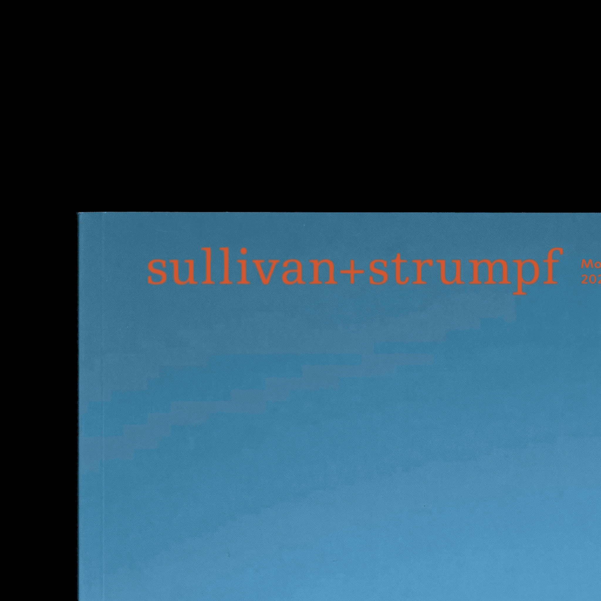
Sullivan+Strumpf

I contributed to the design of a publication for Sullivan+Strumpf, one of the Asia–Pacific’s leading contemporary art galleries. The publication serves as a curated showcase of the gallery’s artists and exhibitions, combining refined editorial design with a confident, contemporary visual language.

Working with the team at More, I helped shape layouts, typography and pacing to balance clarity with expression, allowing the artwork to take centre stage while maintaining a cohesive, elevated reading experience.

Studio

:

Role

:

Publication Design

Year

:

2024

Click or Drag

Click or Drag

Click or Drag

Sullivan+Strumpf

I contributed to the design of a publication for Sullivan+Strumpf, one of the Asia–Pacific’s leading contemporary art galleries. The publication serves as a curated showcase of the gallery’s artists and exhibitions, combining refined editorial design with a confident, contemporary visual language.

Working with the team at More, I helped shape layouts, typography and pacing to balance clarity with expression, allowing the artwork to take centre stage while maintaining a cohesive, elevated reading experience.

Studio

:

Role

:

Publication Design

Year

:

2024

Tap or Drag

Tap or Drag

Tap or Drag

Every Building on Cuba St

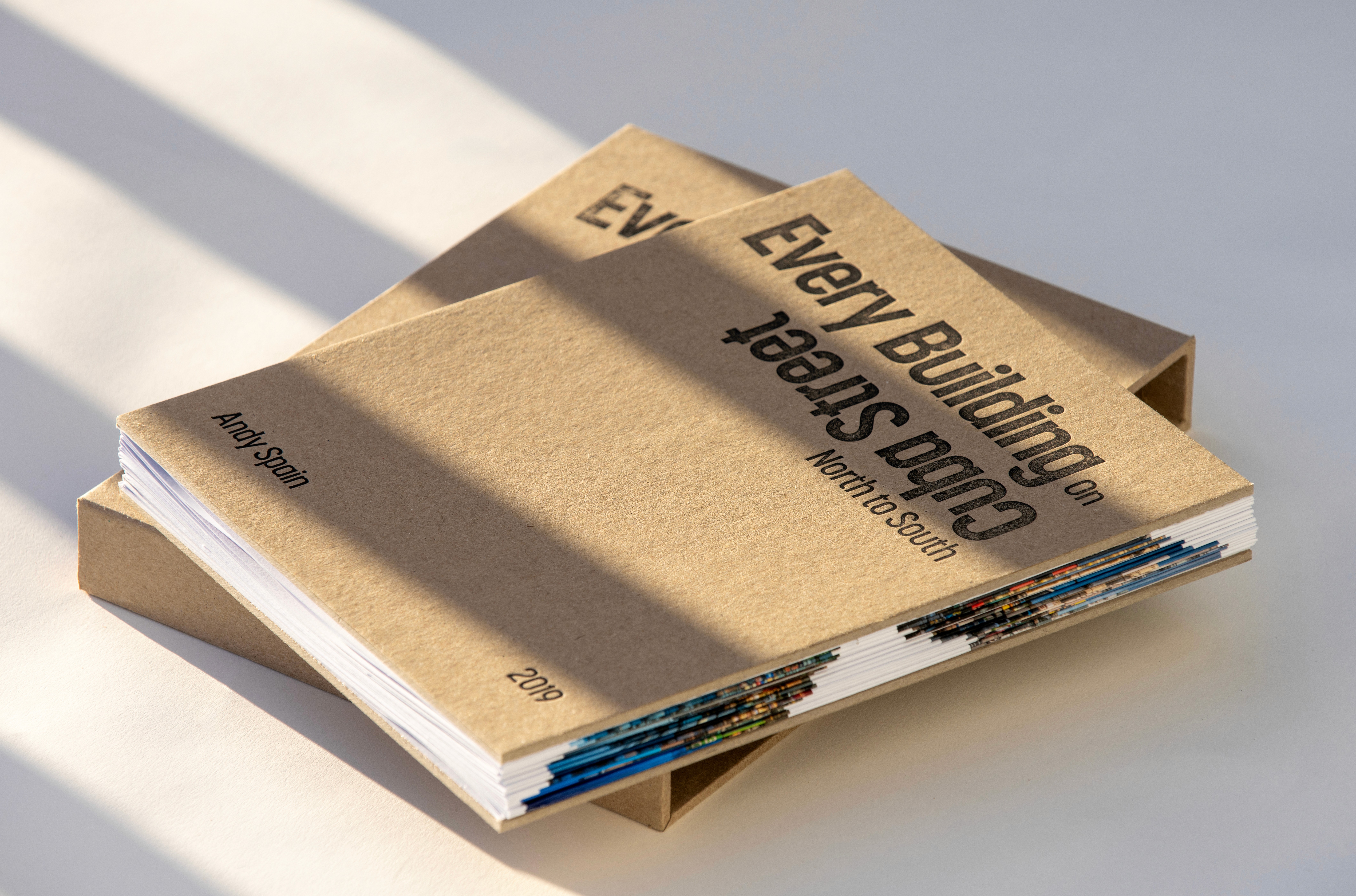
Every Building on Cuba Street is a concertina photobook created for architectural photographer Andy Spain. Spanning over seven metres, it presents a continuous panorama of Wellington’s most iconic street, capturing its eclectic architecture as a single, unfolding image.

The design mirrors the rhythm of a pedestrian’s walk, allowing the book to be flipped and rotated to travel north–south or vice versa. Its accordion structure invites physical interaction, creating a reading experience that feels both sculptural and intimate.

Produced in a hand-folded edition of ten, each copy was crafted to preserve alignment and rhythm across the full length of the panorama. The result is a piece that merges design, photography and place, a tactile record of Cuba Street’s evolving identity.

Client

:

Collaborators

:

Andy Spain

Role

:

Publication Design

Year

:

2024

Click or Drag

Click or Drag

Click or Drag

Every Building on Cuba St

Every Building on Cuba Street is a concertina photobook created for architectural photographer Andy Spain. Spanning over seven metres, it presents a continuous panorama of Wellington’s most iconic street, capturing its eclectic architecture as a single, unfolding image.

The design mirrors the rhythm of a pedestrian’s walk, allowing the book to be flipped and rotated to travel north–south or vice versa. Its accordion structure invites physical interaction, creating a reading experience that feels both sculptural and intimate.

Produced in a hand-folded edition of ten, each copy was crafted to preserve alignment and rhythm across the full length of the panorama. The result is a piece that merges design, photography and place, a tactile record of Cuba Street’s evolving identity.

Client

:

Collaborators

:

Andy Spain

Role

:

Publication Design

Year

:

2024

Tap or Drag

Tap or Drag

Tap or Drag

Midnight Reverie

Midnight Reverie was a group exhibition in which four artists explored their experiences of the night. I was responsible for the design across all touchpoints, from posters, invitations and wayfinding to the website, social content and exhibition catalogue.

The design system connected art and audience through a visual language that reflected the night’s softness, elegance and sense of discovery. Typography, colour and spacing were used to evoke stillness and movement, like wandering through the dark, guided by curiosity.

Across print and digital, the system unified the exhibition experience, encouraging moments of reflection and immersion. It aimed to capture not just the look of night, but its rhythm and feeling, calm, open and quietly transformative.

Role

:

Creative Direction, Digital, Signage, Print

Year

:

2023

Click or Drag

Click or Drag

Click or Drag

Midnight Reverie

Midnight Reverie was a group exhibition in which four artists explored their experiences of the night. I was responsible for the design across all touchpoints, from posters, invitations and wayfinding to the website, social content and exhibition catalogue.

The design system connected art and audience through a visual language that reflected the night’s softness, elegance and sense of discovery. Typography, colour and spacing were used to evoke stillness and movement, like wandering through the dark, guided by curiosity.

Across print and digital, the system unified the exhibition experience, encouraging moments of reflection and immersion. It aimed to capture not just the look of night, but its rhythm and feeling, calm, open and quietly transformative.

Role

:

Creative Direction, Digital, Signage, Print

Year

:

2023

Tap or Drag

Tap or Drag

Tap or Drag

The Big OE

The Big OE is a response to the ISTD brief Mapping the World, which challenged designers to explore mapping as a tool for insight and storytelling.

In 2018, I travelled through 14 countries and 23 cities across Europe by train, documenting my journey through data and collected ephemera. The project translates this information into a visual and statistical map of the experience, capturing not only the physical routes taken but also the cultural and economic contexts that shaped them.

Through careful curation of data, imagery and materials gathered along the way, The Big OE becomes both a map and a memory, a personal record of movement, connection and discovery.

DINZ Best Award

:

ISTD

:

Pass

Year

:

2023

Click or Drag

Click or Drag

Click or Drag

The Big OE

The Big OE is a response to the ISTD brief Mapping the World, which challenged designers to explore mapping as a tool for insight and storytelling.

In 2018, I travelled through 14 countries and 23 cities across Europe by train, documenting my journey through data and collected ephemera. The project translates this information into a visual and statistical map of the experience, capturing not only the physical routes taken but also the cultural and economic contexts that shaped them.

Through careful curation of data, imagery and materials gathered along the way, The Big OE becomes both a map and a memory, a personal record of movement, connection and discovery.

DINZ Best Award

:

ISTD

:

Pass

Year

:

2023

Tap or Drag

Tap or Drag

Tap or Drag

JJ du Plessis

About:

I’m a visual communication designer based in Naarm/Melbourne, focused on building thoughtful, cohesive brands. My work spans strategy, identity, editorial and digital design, always led by process, clarity and strong visual craft.

I create brand systems, publications and digital experiences for clients across education, arts, food and culture. My approach is grounded in research and collaboration, shaping design that’s both intelligent and practical.


Awards & Recognitions:

International Society of Typographic Design Membership

DINZ Best Awards Finalist 2024

DINZ Best Awards Bronze 2023

DINZ Best Awards Finalist 2022


Contact:

jjdp123@gmail.com

Selected Works

Updated: 21.11.2025

< click to scroll >

Girton Grammar

Girton Grammar is a leading independent school in Bendigo with a long-standing reputation for academic excellence and strong community values. The project is a comprehensive brand refresh designed to evolve the school’s image from traditional and formal to confident, contemporary and connected.

I led the identity development from strategy through to execution, overseeing the design of the new crest and logotype, establishing a refined typographic system, updating brand language, and directing photography and campaign art direction.

The refreshed identity will roll out across every facet of the school, from advertising and communications to signage, uniforms and digital platforms, creating a unified and enduring brand that honours Girton’s heritage while expressing its progressive vision for the future.

Label

:

Text

Label

:

Text

Label

:

Text

Label

:

Text

Label

:

Text

Click or Drag

Click or Drag

Click or Drag