
Girton Grammar is a leading independent school in Bendigo with a long-standing reputation for academic excellence and strong community values. The brief was to evolve the school’s identity beyond its traditional, formal perception; to retain its heritage while expressing a more confident, contemporary and connected character.
The refreshed brand needed to honour history without feeling historic. It required clarity, authority and warmth in equal measure.
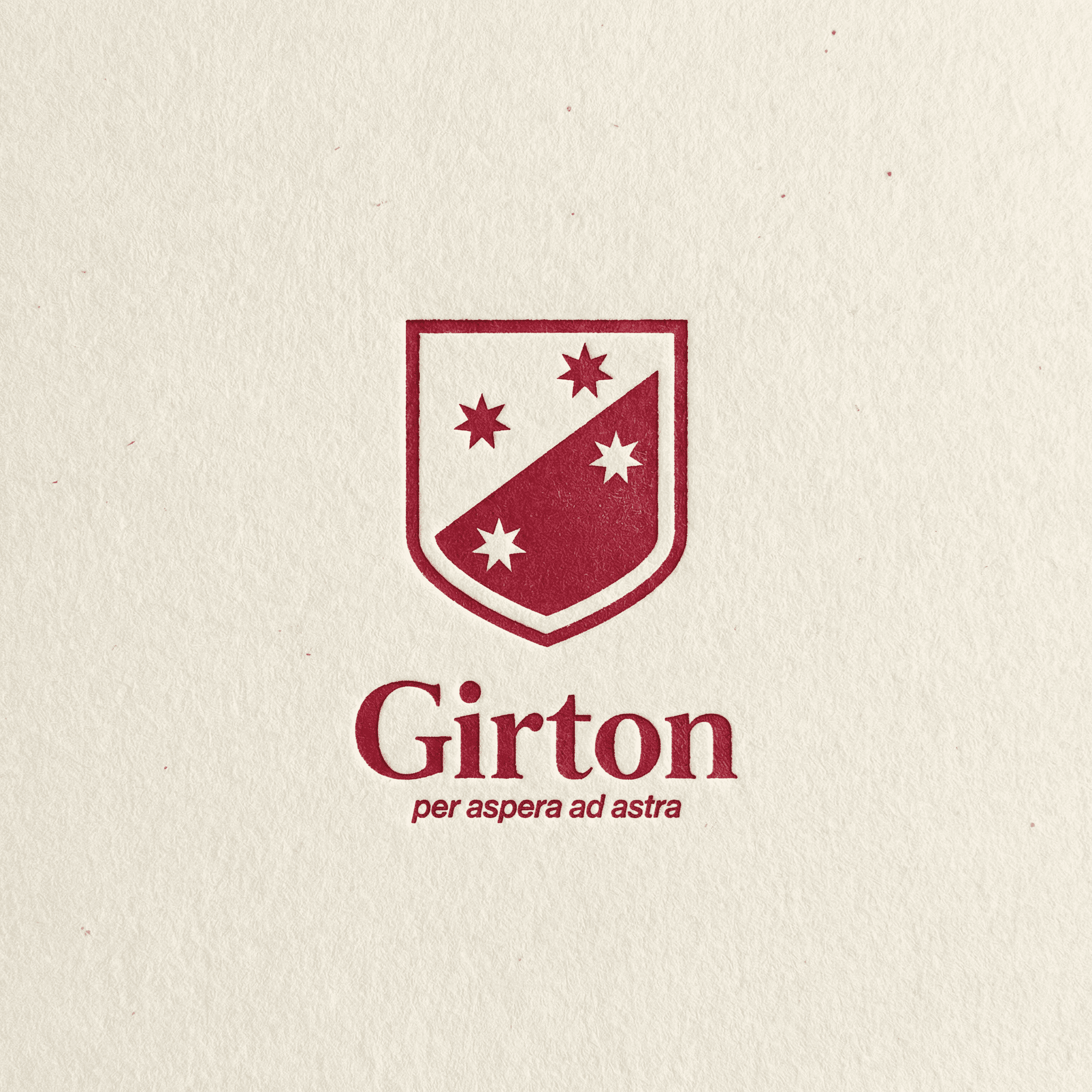
I approached the project as a careful recalibration rather than a reinvention. The existing crest was refined and rebalanced, preserving recognisable elements while introducing greater precision and cohesion. A new logotype was developed to sit alongside it, bringing structure and modernity to the brand’s typographic voice.
A considered typographic system was established to carry both gravitas and approachability. Hierarchy is clear and disciplined, yet flexible across applications. Brand language was updated to feel grounded and confident, reinforcing Girton’s progressive leadership and strong sense of community.
Photography direction shifted toward authenticity and connection. Campaign art direction focused on clarity and compositional restraint, allowing students, spaces and moments to speak without excess.
The resulting identity balances tradition and progression. It respects Girton’s legacy while positioning the school with renewed confidence and clarity.
Rolled out across communications, advertising, signage, uniforms and digital platforms, the system creates a unified and enduring presence; one that reflects both academic excellence and a forward-looking vision.
Client
Girton Grammar
Year
2025
Deliverable


Credit
Studio | SOLID |
Web | SOLID |